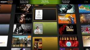
Image source: Amazon Windowshop
Am I the only person who missed this? This month Amazon launch Windowshop Beta, a CoverFlow-ish interface for shopping. This flash based interface allows you to search new selections, which are added each Tuesday. Browsing is controlled with the space bar to zoom in and the arrow keys to navigate, giving it the user experience of an 80s PC video game (that’s not a bad thing.) However, the categories of “Best selling,” or “New releases” have limited appeal to me.
I’m not a user of CoverFlow, mostly because most of songs don’t have images attached to them, so the UX is pretty lame for me. But I think that some of the Silverlight interfaces and visual search engines like SearchMe and Riya are showing promise. Clearly, Amazon is trying to emulate the browsing experience of the brick and mortar store. However, just like I only browse certain sections of a book store, it would be great to have that kind of granular control in Windowshop. If you could combine some search, and narrow the selections down to topics or areas of interest, and then browse through 100 or so titles, we would *really* have something to write up in here.


