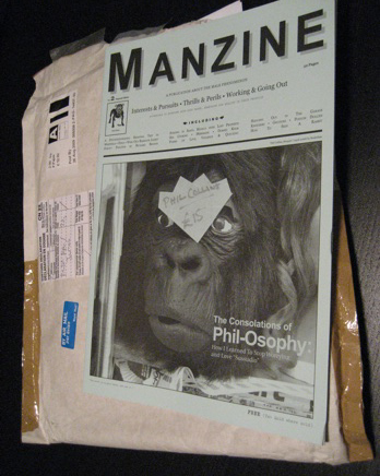
I recently got a nice package in the mail, my eagerly awaited issue 2 of Manzine. What looks like a large format zine is actually a clever take on mens magazines. Created by a group of writers and designers based out of the UK, who write for places like The Guardian, British GQ, and Arena (RIP,) Manzine riffs upon the world they helped created.
On a previous trip to London, I had the pleasure of meeting up with one of the writers Kevin Braddock, who I was first ran into after scouring the internet for a copy of issue 1.
I’m an avid fan of magazine publishing. Manzine has been added to my collection of Chap, Butt, and Fantastic Man. Going to sort of great lengths to find semi-obscure and certainly obscenely expensive international titles. (London, by the way, has some truly, awesome magazine shops, like RD Franks 5 Winsley Street, London W1 8HG T: +011 44 20 7 636 1244. Of course the exchange is a killer.)
But back to the issue at hand, no pun intended. Manzine is a different take on magazines, that moves in the opposite direction of creating magazines as art object. Here, Braddock and his conspirators, have gone indie, dyi, and underground. In he face of the ongoing implosion of the magazine industry, the writers, while still keeping their day jobs, are producing articles and columns that feel much more personal than you get in men’s mags, like writing about learning out to play pop songs (specifically by Phil Collins.) The article destructing the sexuality of a mermaid is more, dare we say intellectual, than what you get in Details or GQ.
The magazine, itself, feels disposable. Its low-fi design and barely better than newsprint paper quality, and of course, cheeky design give it a cheap look and feel to go with its a couple of pounds pricing, (Free (Two Quid where sold.)) As we learned in grade school, looks are deceiving, and judging books by their covers leads to misinterpretation. At first opening, I just liked looking at it, with its over use of typefaces and seeming new style guides for each two page layout. However, when you actually starting reading, personal articles about the art of fixing up a bicycle, an honest voice comes through the guy-ish surface.
What better way to spend one’s spare time than trying to reinvent and resuscitate magazine?


