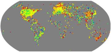
Frank pointed out some clever research at Microsoft Research. Eric Horvitz and Jure Leskovec parsed through one month of MSN messenger communication, or about 1 billion conversations a day. Among the 240 million users, they discovered an average of 6.6 degrees of separation between any two random users. 6.6 is obviously close to the famed six degrees of separation found in Milgram’s 1967 study. Although, some debate still continues on the validity of that finding. Horvitz made the full paper available, and has really in depth analysis of the spread of MSN Messenger and the communication it facilitates. The image above shows the density of users. The numbers of user shift from high to low according to the light spectrum, with red as high and blue as low (think ROYGBIV.) Since this finding, Horvitz wonders if there is some larger phenomenon at work, with six being some natural average of social interconnectedness. More thoughts to keep me up at night.
6.6 degrees of seperation
the frequency of a word: Awesomeness

Figure 1. Frequency from 2/2004 to 2/2008

Figure 2. Frequency from 4/2005 to 2/2008
Every once in a while, I get the inclination to try to do a little math. It’s a dangerous endeavor, but sometimes I can’t help myself. But before I get ahead of myself, I should give a little back ground.
Sometimes you learn a word and all of the sudden you see it everywhere. The nagging question is, was is always being used and you just glossed over it, or is there a change in the frequency of its use? You discovered the word precisely because it was starting to be used for more often.
Not too long ago, I found the word “awesomeness” entering my general vocabulary to signify great approval. Awesomeness feels fresh, a slight tweak on the new vintage “awesome” from the 80s, a personally influential era. However, in the past week, I’ve seen the word Awesomeness appear in a lot of places, from friends and strangers alike. I started thinking if the word has gaining traction in the public at large, so last weekend I started the quest to figure out ways to capture the growing use of the word.
Word frequency counts is nothing new. Media studies have been doing this type of research in newspaper and magazines for decades. However, it is becoming much more democratic, mostly because of the decreasing cost of computing and the related increase span of the web, which has been collecting data much easier. I decided to use the blogosphere because it seems like a pretty good proxy for general language usage. As well, the Google blog search feature allows you do set the dates for your search. Of course there are drawbacks to uses the word count of Goggle, including that the blogosphere is a obviously a subset of general usage and also because I have no idea how Goggle tracking and tallying the blogs it is indexing. Nevertheless, I can live with the approximation, given that the only cost for retrieving the data is bandwidth and time.
I searched for “awesome,” “awesomeness,” and “are” for each month from February 2004 to February 2008.
The word “are” was used as a control of sorts. Because the blogosphere itself it constantly growing, the number of times a word appears in a given month is expected to increase. Using an often used word such as “are” can be a proxy of the overall growth of the blogosphere. One could not expect the rate of the word “are” to fluctuate greater from month to month. Any true increase of the word usage would have to outpace the growth rate of “are.”
I also tracked the usage of the root word “awesome” for a couple of reasons. Sometimes search engines clump different variations of the same root word together in its search results. I wanted to check to see that “awesomeness” wasn’t being put together with “awesome.” The two are also an interesting comparison. If both increased at similar rates, then maybe what I am seeing is just an overall revival of 80s idioms. However, if “awesomeness” is also increasing at a great rate than “awesome” my original suspicions would be validated.
In the short time I started on this little math adventure, the word kept on appearing, and in the write up of my findings, I came across the the ultimate reference, apparently a website which declared March 10 (last week) International Day of Awesomeness.
Just looking at the words appearance in the past two full months, this is what I found:
February-2008: Awesomeness: 17,182 ; Awesome: 736,783 ; Are: 61,531,049
January-2008: Awesomeness: 9,627 ; Awesome: 429,769; Are: 57,214,958
There is clear jump in the past two months, but what does that jump mean, if the total number of blog pages continues to grow? Both Awesomeness and Awesome almost doubled as compared to Are, but how do you measure the significance of that? Graphing all the frequency of these three words against each other is hard because are orders of magnitude higher then the others. My math coach Pam (yes, I actually call her that) suggested I take the log of my data to make it more comparable. If your recall high school math, log (1,000,000) = 6, log(100,000) = 5, and log(10,000) = 4. Now, if you take the log of all your data points, the curves can fit on a single graph of manageable size. It even gets better, because it translates an exponential curve into linear curve, which makes finding the growth rate (i.e. slope of the curves, which is the rise over run of the function) much easier.
If you look at the two figures, you’ll notice an upwardly trend. There is a peculiar elbow in the spring of 2005, which could be a big spurt of growth or some aberration of Goggle’s indexing. After looking at the first graph, I decided to draw another graph to focus in other growth of all three term’s use in the past year and focus the analysis on that because I wanted to fit a linear line to the curves and removing the bend would give me a closer fit. (Is that cheating?)
I fed the curves into excel to fit linear functions, and can see that Awesomeness has a slope of 0.0003 versus Awesome which has a slope of 0.0001. This is good, because it means Awesomeness is being used at rate that is 3 time more than Awesome. However, Are (our base line) has a slope of 0.001. This is sort of bad, because 80s slang doesn’t seem to be outpacing the general growth of blogs, which I was hoping to see.
I’m not sure what to make of it, in the end. However, it does have me thinking about blogs from a higher altitude and that math is pretty awesome. Many thanks to Pam and Wojciech who gave me some good nudges. Of course, I’ll take the blame for the conclusions. I’m curious to hear what my math friends say, especially if they find mistakes in my logic. Also, it has taken me much too long to post this, which is why I’m just throwing what I have up. I’ll post any corrections later including typos.
Regional social networks
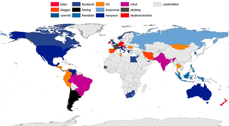
I have IM accounts on AIM, iChat, Yahoo, MSN, Gmail and Skype. (Years ago, I once used ICQ and IRC.) I always find it interesting, how certain services are popular in specific countries. AIM is most popular in the US, where as, MSN more widely used in Asia, South American, Canada. IM, like all networks, benefit from network effects. If a service gains traction early in a country, when it can maintain growth, even if it is surpassed by other services who may be globally larger.
The shrunken image above from Valleywag shows which social networks are most dominant by market share, which was tipped off to me by hellowojo. The color coding is a bit confusing, because they decided to make match the countries by the color of the social network’s logo. Because most of social networks logos are blue, a network’s reach is difficult to differentiate. Fortunately, Valleywag also includes another graphic with a list of all the countries by social network.
Going forward these data will change. I wonder if there will be a consolidation of these networks, start into interconnect, or with they stay fractured, in the same way that email addresses were once closed. Here are a couple of possible of future scenarios.
Just as standards for email have been created, Open Social or some other social networking set of standards can allow for competing sites to share information with each other. WordPress or Moveable Type could become the open platform, where people host their own blog which would act like their profile, or use a service provider to maintain their profile/blog. Gigaom has postulated WordPress’ move into social networking. Third party widgets could be created to offer function, such as status updates, photo albums, walls, and gifting applications to mimic many of the features of Facebook, LinkedIn, MySpace and others SNS. This sounds like a lot more work for the end user, which would be fine for the people who want to have control and heavy lifting which that entails. For the Blogger and LiveJournals users of the world, adoption is only going to take place if setup is as easy as creating a Blogspot or Facebook account.
Where the first example envisions some combination of blogs and SNS, another example is email fully integrating with social networking profiles. Google has been able to effectively enter the IM space by introducing a closely integrated chat client into its Gmail service. By sidestep the application download step, millions of their email users instantly became IM users. Similarly, the Xobni Insight plugin for Outlook, connects information profiles on email contacts, giving Outlook an SNS feel. I haven’t used Outlook in a couple of years, but if I did, I would certainly be trying to get a copy of Insight, which is still in an invite-only beta.
The final possibility to consider is the consolidation of social networking sites into one main site, which may have an open API like Facebook, but is also closed and propritary in the sense that people cannot easily export their profile data out of Facebook, MySpace, or Orkut. While people can leave at any time, if all your friends and contacts use a network then there is incentive to stay in that network. In this way, a company like Google, Yahoo, and MSN could use its adjacent email or blogging services to leverage its entrance into social networking and possible become the de facto platform. Although, as of yet, none of these sites have been about to make a major impact across continents.
So, I guess we’ll just wait and see what happens.
March is the month of magazines

Image source: Style.com and Vogue.co.uk
When March rolls around each year, fashion magazines present their Spring/ Summer fashion issues. This usually means issues of a US-published magazine such as Vogue are hundreds of pages thicker than others times of the year. Most of the additional pages are advertising from fashion brands. UK and European magazine, while still focusing on the upcoming season, maintain their standard, thinner size. As with many similar US versus European comparisons, American Vogue more heavily relies on ad pages to generate revenue, where as British Vogue which is more subscription based business model. Regardless of business model, both maintain their statue in the fashion publishing industry.
As I understand the magazine publishing world, magazine advertisers pay rates based on circulation. Higher circulation leads to higher ad rates. Although, some niche audience magazine will command higher rate for somewhat lower circulation numbers, about the marketing will be more targeted. American Vogue, along with many other magazines published in the US, has the incentive maximize their circulation. One result of this incentive, is that American Vogue has expanded beyond pure fashion editorial, and into what one might call “Vogue lifestyle.”
To spread the appeal of American Vogue, celebrities most often that in the past, grace their covers, rather than the models on their European counterparts. American Vogue’s big spring issue featured Drew Barrymore, where as, British Vogue had supermodel Kate Moss. While Moss is a celebrity herself, she is still primarily known for being a model. A better comparison would be the February 2008 issues, with British Vogue featuring Russian model Sasha Pivovarova (the face of Prada for much of the decade) as opposed to the cover of its American counterpart with actress Kate Bosworth plugging her movie “21”.
The sacrifice of expanding American Vogue’s subject matter, is the decreasing coverage of solely fashion editorial photography and articles. Instead, the magazine covers celebrities, food, beauty, and travel. Admittedly, because American Vogue has a much bigger circulation and therefore bigger budget, the fashion editorial shoots do have higher production values. Further, their food critic,
Chris Anderson of Wired recently published his article on Free. Much of the free content on the web is ad supported. Because ad-based models, including the likes of Goggle, were the initially profitable web media, the Me-toos of the digital world are all following suit. Interesting, in the web 1.0 era, people used to point to the WSJ.com as the golden child site, which got people to pay for it, something that most newspapers have never been able to do.
However, there is something to be still said for pure subscription content model. Anderson is obivously a smart guy, but I hope that his ideas on Free don’t encourage people to blindly pursue ad-based models, without really reading what he is discussing. Towards the end of his article, he notes that in a Free economy, attention and reputation become scare resources, and sometime, that people are willing to pay to receive.
British Vogue is much more narrowly focused on pure fashion editoral, which may make it more niche. But there isn’t anything wrong with that smaller audience of people looking for strong fashion writing and photography. There will always be a market for targeted content, it is just that the standard for what people are willing to pay for has risen. The death of the subscription model is premature and should not be discounted. The game is just a lot harder than it used to be.
My First Songchart: The Directly Proportional Relationship Between Money and Problems
Brian hooked me up to this great Flickr group, Songchart, which combines pop culture references with graphs and charts. So, I gave it a go. Try to guess the song. Enjoy.
Update: Link to the reference.
Gary Gygax died on Tuesday.

Images source: Wired.com
I was sad to just find out that Gary Gygax, the creator of Dungeons & Dragons died on Tuesday.
I haven’t played D&D in about twenty years, and when I did I was never particularly very good at it. But it was 80s, and video games still had 8 bit graphics, and I was really into creating characters, lead figures, and dice with more than six sides. Eventually video games would get more advanced, and D&D seemed to be passed its peak. As his obit in the The Time Online noted, his influence can be seen in years to come. The early 3-D first-person shooter games that started appearing in the mid-90s, such as Doom (even if it was more sci-fi than fanasty, the player is still running around a subterranean maze of sorts), Myst, and World of Warcraft come to mind. Magic the Gathering seems to be an obvious extension of D&D as well, although not a video game.
I appreciate that fact that Gygax didn’t particularly like video games, and never designed one. As he was quoted in an interview in 2005, that Dungeons & Dragons “offers camaraderie, imagination, socialisation… Computer games can be so isolating. They’re not anything like sitting in a group and laughing, telling stories. You can’t share a bag of Cheetos online.” And even though I’m still not a huge gamer, there are still residues of my D&D days such as a love of graph paper and my DVD box-set of the Dungeon & Dragons animated series voiced by Willie Aames ( Tommy from “Eight is Enough” and Don Most (Ralph Malph from Happy Days.)
D&D seems to continually appear in random places over time. The last episode of Freaks and Geeks, Discos and Dragons, which is amazing and some of the best television ever produced. The opening lines to In the Garage by Weezer, “I’ve got a Dungeon Master’s guide, I’ve got a twelve-sided die,” is brilliant. However Gygax’s influence, as alluded to before, moves beyond that of kitschy, vaguely ironic pop culture references.
More recently, I went to a panel on gaming for the book, The Game Design Reader: A Rules of Play Anthology by Katie Salen and Eric Zimmerman. One of the speakers included in the anthology was Gary Alan Fine, a sociologist, now at Northwestern. In the 80s, he did an great ethnographic study of role playing gamers, including ones who played Dungeons & Dragons, which he documented in his still in print book, Shared Fanasty. The book contains knowing insight into the players of these games and their social structures, during that period, and still has relevance today as new (or perhaps not so new) social structures and conventions are being created in today’s MMRPGs.
Players of D&D in the 70s and 80s went on to advance the world in computer science and gaming, which clearly influenced the development of these technologies and environments for better or worse. We are only recently moving beyond these motifs and initial sources of inspiration in our increasing digital and interactive world. However, it is still important to mark the influential role that Gary Gygax played in the development gaming and virtual worlds, even if he lived in relative obscurity to the world at large.
Rebuilding monuments

On February 10th, just a few blocks from my hotel, an arsonist burned Namdaemun or “South Gate,” in central Seoul. It was one of the oldest original structures dating back 600 years, and had survived the Korea War as well as the various occupations of foreign countries. The Cultural Heritage Administration is stated that it will spend over US$20 million to rebuild the gate over the next three years.
In Seoul, people don’t navigate via street addresses. Instead, people use landmarks to describe locations. For example, people often give taxi directions in terms of going down a main road and turning at the movie theater. Namdaemun, then, was an important fixture for more than historic reasons. It also held a function, being used to explain the location of surrounding destinations such as the street markets, malls and office buildings that surround it.
Central Seoul has many palaces, walls and gates which are have reconstructed over many years, and now Namdaemun will join them. The historic sites have been built and rebuilt. Just north of Namdaemun, is Gwanghwamun, another gate dating back to the same period. The structure had gone through several reconstructions. It is also currently being disassembled and moved 15 meters and also rotated to realign it with the Gyeongbok Palace, its original position.
The idea of building and rebuilding cultural historic monuments is fascinating. We think of these structures to be permanent, however like all architecture and cities, they get built, altered, torn down, and rebuilt.
I hate Santa, bunnies, and spring.

Last weekend, I caught up with Brian, an architect, for breakfast and our usual discussion of Japanese design and culture v. the US. Japan usual wins, and I end up with an urge to visit Tokyo. Afterward, we were both off to our respective offices on the ACE subway line. Brian was going uptown and I was heading downtown. We said good byes and walked down our different platforms, which led to the inevitable awkward sighting across the tracks. I’m never sure what the correct protocol is in the instances, as we already said good bye. If this were Seoul or Tokyo, I’d send an ironic SMS. No such luck. We nodded (but not quite waved) and simultaneously inserted our white earphone to erect our iPod bubbles.
As part of a public art project, vintage cartoonish bronze sculptures by Tom Otterness were installed throughout the 14th Street ACE station. I’m not often in this station these days, moving out of the area right before these sculptures moved in. These admittedly cute, yet slightly deviant, works are beloved by New Yorkers and tourists alike. They are constantly photographed via camera phones and more sophisticated equipment by passers-by. As I stared at this one particular piece “Life Underground,” all I could think about is how I really don’t care for them. And this particular Sunday, I didn’t care for them enough to take our my camera and take a quick snapshot.
I’ve found that the fans of these sculptures (which far out number me) run across education levels and where people live. When I share my opinion with them, I feel like I telling them I hate Santa, bunnies, and spring because the basic reaction is, “how you could not like sometime so cute and fun?” And they do have a point, because I do like some of work of Takashi Murakami. (Is it just because the artist is Japanese, making the work inherently cooler?)
I was going to continue and try to explain in length why they don’t do anything for me. However, the more interesting question is, why is there this (my?) need to constantly defend and formulate critical arguments for what amounts to personal taste?
Long overdue… but I’m back.

Well, I am finally posting. Work and life got a little crazy, and something had to give. That something was side projects, like blogging. However, I’m back from a week in Seoul and I’m almost adjusted to this time zone. When I travel, people always seems to tell me to take lots of pictures, which I enviably never do. However, I did manage this time around. Here’s a map of an underground mall in Seoul. These malls and subway stations are sprawling and can cover a few city blocks. Like in Tokyo, directions to a location often tell you the specific exit, which are numbered, you need to take. Getting from one end of the station to another can take twenty minutes to walk on the street, which makes using the correct exit rather important.
On my free day, I took the Circle Line (formerly called Line 2) all the way around. I was going from City Hall to the Coex Mall at the Samseong station, which is not quite half way around. So I went there and returned going the same direction. (Counter clockwise if you’re curious.) Being non-rush hour, it was quite relaxing, and the people watching is always good. It was also much warmer than cold Korean winter air outside.
I decided to forgo the standard shot of a teenager watching television (DMB) or talking on their mobile in the subway. Flickr is full of photo displaying Koreans using the high bandwidth in the subway that we dream about back home. Thankfully, earbuds are always used. Conversations are at low volume, with one hand holding the phone and the other covering the mouth to limit the noise to others. After a week of seeing it, I started doing it myself. I’m not sure New Yorkers would be so polite, when mobile phones finally work on the MTA. It’s striking how the culture of use evolved differently here.
OT: Murder rate of zero.

Image source: New York Magazine
This week New York Magazine cover story is about New York’s dropping murder rate, and asks the question, what would it take to get the rate down to zero? My only response is, didn’t that already get figured out in Minority Report?

Image source: IMDB

